The 15-Minute Website Response Test: How Small Businesses Can Find the Friction Costing Them Leads
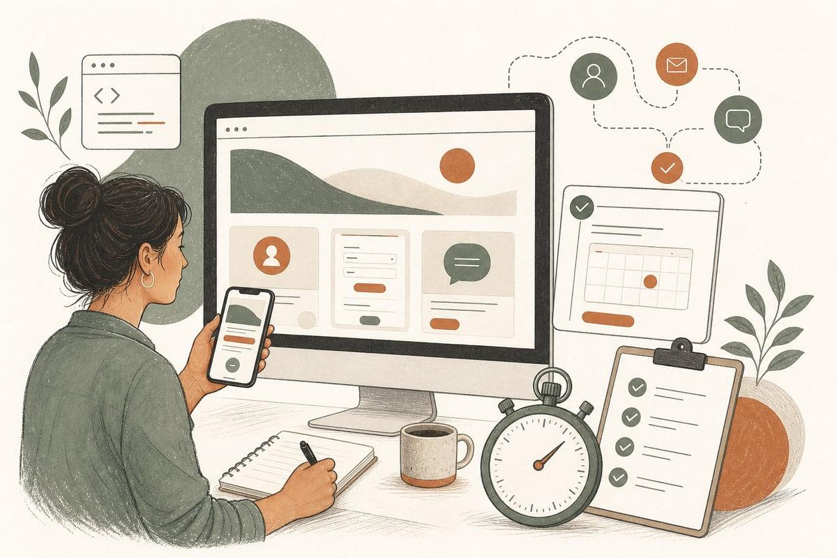
Your website may not need a redesign to get more leads. Often, the fastest win is finding the small bits of friction that make real prospects hesitate, give up, or choose a competitor instead.
What is a website response test?
A website response test is a simple exercise: you pretend to be a customer with a real need, then try to contact your business through your website as quickly as possible. The goal is to see how easy it is to take the next step from a visitor’s point of view.
This is not a technical audit. It is a buyer test.
You’re looking for questions like:
- Can someone tell what you do in 5 seconds?
- Can they find the right service page quickly?
- Is the next step obvious?
- Does the contact method feel easy and trustworthy?
- Does anything create doubt, delay, or confusion?
For many small businesses, this test reveals problems that analytics alone do not make obvious.
Why this matters more than owners think
Business owners usually know their services too well. That makes it easy to miss where a first-time visitor gets lost.
A prospect does not read your site like you do. They are usually trying to answer a few urgent questions:
- Do you handle my problem?
- Do you serve my area?
- Can I trust you?
- How do I contact you right now?
- What happens after I reach out?
If your site makes any of those answers hard to find, lead quality and conversion rate suffer.
The hard part is that friction is often subtle. The site may look modern and still lose customers because:
- the headline is vague
- the phone number is hard to tap on mobile
- the form asks for too much too soon
- the service pages do not match what buyers search for
- the call to action is buried
- the site feels slow or awkward on a phone
- users are not sure whether anyone will actually respond
The 15-minute website response test
Set a timer for 15 minutes. Use your phone first, not your desktop. Most local-service traffic now starts on mobile, and that is where friction hurts most.
Pretend you are a real prospect. Pick one common scenario, such as:
- “I need a family law attorney in Pasadena.”
- “I need a same-week HVAC repair quote.”
- “I need a dentist who takes new patients.”
- “I need a nonprofit website designer.”
Then go through these steps.
1. Land on your homepage and count to five
In five seconds, can a stranger clearly tell:
- what you do
- who you help
- where you work
- what they should do next
If not, your homepage may be creating uncertainty immediately.
Good signs:
- a specific headline
- a visible call button or contact path
- service and location clarity
- proof elements like reviews, awards, or trust badges
Weak signs:
- generic slogans
- stock-photo-heavy hero sections with little substance
- too many competing buttons
- no visible next step
2. Try to find the exact service you need
See how many taps it takes to get to the correct service page.
If a visitor needs one specific service, they should not have to decode your navigation. For example, “legal help,” “home services,” or “marketing solutions” may be too broad if buyers need a more exact fit.
Ask:
- Is the service labeling obvious?
- Does the page title match what people actually search for?
- Is there a dedicated page for this service?
- Does the page explain who it is for and what happens next?
If people have to guess which page applies to them, some will leave.
3. Try to contact the business immediately
Now act impatient. Assume you want to reach out in under 30 seconds.
Test every major contact path on mobile:
- tap-to-call phone number
- contact form
- chatbot or live chat
- text option
- online booking
Look for friction like:
- phone number not sticky or easy to find
- forms that ask for too many fields
- booking flow that requires account creation
- chat that opens with generic fluff instead of useful choices
- no indication of response time
One of the biggest conversion killers is uncertainty after the click. People want to know whether they are starting a real conversation or dropping their information into a void.
4. Submit a test lead
Actually fill out the form or booking request.
Then check:
- Did the confirmation page make sense?
- Did you receive an email or text confirmation?
- Did it set expectations for when someone will reply?
- Did the lead go to the right person internally?
Many businesses lose leads after form submission, not before it. A broken notification, weak autoresponder, or unclear thank-you page can reduce trust fast.
5. Repeat the test on desktop
Desktop still matters, especially for B2B, legal, medical, and higher-consideration services. But mobile usually exposes more issues first.
Compare:
- Is the call to action stronger on one device than the other?
- Does the layout hide key content on mobile?
- Are trust signals harder to find on smaller screens?
- Does page speed feel noticeably worse on mobile?
What friction usually looks like in the real world
Here are common problems this test uncovers.
Vague messaging
If your homepage says something broad like “Solutions for Every Need,” that does not help a buyer decide whether you are the right fit.
Fix it by naming the service, audience, and geography clearly.
Too many calls to action
When every page asks users to call, chat, request a quote, subscribe, learn more, explore services, and book a consult, many users do nothing.
Fix it by prioritizing one primary action and one secondary action.
Contact friction on mobile
This is especially common on older WordPress sites or page-builder-heavy websites.
Fixes may include:
- sticky mobile call button
- shorter forms
- larger tap targets
- faster page loads
- simpler menus
Weak service pages
If the service page is thin, generic, or written around your internal terminology, visitors may not feel confident enough to inquire.
Fix it by explaining:
- what the service is
- who it is for
- common problems solved
- service area
- how to get started
No reassurance after form submission
A weak thank-you message creates doubt.
A better confirmation tells users:
- we received your request
- here is when you will hear back
- here is what to do if it is urgent
A simple scorecard you can use today
Give each item a pass or fail:
- Homepage clearly says what you do
- Homepage shows who you serve and where
- Primary call to action is visible immediately
- Correct service page is easy to find
- Contact method is obvious on mobile
- Form is quick and easy to complete
- Booking or chat flow feels natural
- Trust signals are visible before contact
- Confirmation after submission is clear
- Your team gets the lead instantly
If you fail 3 or more, you likely have a conversion problem worth fixing before spending more on ads or SEO.
What to fix first if your test goes badly
Do not try to rebuild everything at once. Start with the bottlenecks closest to the lead.
Highest-priority fixes
- Make the next step obvious on key pages.
- Shorten forms to only essential fields.
- Improve mobile contact visibility.
- Add better service-page specificity.
- Fix confirmations and internal lead routing.
These changes are usually cheaper and faster than a full redesign, and they often improve the return on the traffic you already have.
Where AI can help without making your site feel robotic
AI can reduce friction if used carefully.
Useful examples include:
- an AI chat assistant that answers common pre-contact questions
- an AI receptionist that handles missed calls after hours
- automated lead qualification and routing
- instant follow-up texts or emails after form submission
The trade-off: AI should support human follow-up, not hide it. If the automation feels like a dead end, trust drops. The best setups make response faster while still making it clear a real person is involved.
When this points to a bigger website problem
Sometimes the response test reveals issues that are not just friction, but structure problems.
Examples:
- your services are bundled too broadly
- your navigation no longer fits the business
- your mobile experience is outdated
- your WordPress setup is bloated and slow
- your website cannot support better booking, chat, or automation
In that case, the right answer may be a deeper refresh or rebuild. But this test helps you make that decision based on buyer behavior, not guesswork.
The main takeaway
If your website gets visitors but too few real inquiries, do not assume you need more traffic first. Run a quick response test and find out where potential customers are getting stuck.
The best website improvements are often the ones that remove hesitation, speed up contact, and make buyers feel confident enough to reach out now.
Frequently asked questions
How often should I run a website response test?
At least quarterly, and anytime you change your homepage, forms, booking flow, navigation, or contact tools.
Should I test my site myself or ask someone else?
Both. Start yourself, then ask someone unfamiliar with your business to try the same task. Fresh eyes catch confusion faster.
What if my site looks good but still fails this test?
That is common. A polished design does not always mean an easy buying experience. Conversion friction is often about clarity and flow, not appearance.
Can AI really help improve website conversions?
Yes, if it reduces delay and answers simple questions quickly. It works best when it supports a clear human follow-up process.
What if I am not sure whether to fix pages or redesign the whole site?
Start with this test and the highest-friction pages. If the issues are mostly clarity and contact flow, targeted fixes may be enough. If the structure is outdated, a larger rebuild may make more sense.
If you want a second opinion, Webmaster & More offers a free consultation to review your website, spot conversion friction, and help you prioritize the fixes most likely to win more customers: https://webmasterandmore.com/consultation
Free 60-second checkup
How healthy is your own website?
Paste your address, get an instant health check — speed, mobile experience, Google visibility, trust, and security. No email required.
Check my website freeOr just take one tip a month
A short monthly email with one practical way to make your website work harder. No spam, unsubscribe anytime.