Should You Add a Website Header Audit? A Small-Business Guide to Fixing the Navigation and CTA Problems That Cost You Leads
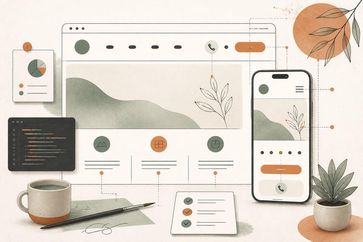
If visitors land on your website and feel even briefly unsure where to click, what you offer, or how to contact you, your header may be hurting conversions. A simple header audit can fix one of the most important parts of your site without requiring a full redesign.
Why your website header matters more than most business owners realize
Your header is the navigation area at the top of the page. It usually includes your logo, menu, phone number, and a primary call-to-action button like Call Now, Request a Quote, or Book a Consultation.
For small businesses, the header does a lot of heavy lifting:
- It tells people they are in the right place
- It helps them find services, locations, and proof quickly
- It gives them a fast path to contact you
- It shapes their first impression of how organized and trustworthy your business feels
If your header is cluttered, vague, or inconsistent, visitors may not know what to do next. That often means fewer calls, fewer form submissions, and more wasted traffic.
Signs your header may be costing you leads
Many headers look fine at a glance but still create friction. Here are some common issues we see on small-business websites.
1. Too many menu items
If your top navigation has 8, 10, or 12 choices, visitors have to work too hard. Too many options can slow people down, especially on mobile.
2. No clear primary action
Some headers have links, but no obvious next step. If a visitor is ready to contact you, the path should be easy to spot.
3. Weak or generic labels
Menu items like Solutions, Info, or Learn are often too vague. Clear labels such as Services, Locations, Pricing, or Contact usually work better.
4. Important trust pages are buried
If reviews, case studies, certifications, financing, or FAQs are hard to find, visitors may leave before they feel confident enough to reach out.
5. Mobile navigation is frustrating
A header that works on desktop can fall apart on a phone. Tiny tap targets, long menus, and hidden contact options are common problems.
6. Your phone number is missing or hard to tap
For service businesses, clinics, law firms, and local pros, a visible click-to-call option can make a real difference.
7. The header changes too much from page to page
If service pages, blog posts, and landing pages all use different navigation logic, users can feel lost.
What a good small-business website header should do
A strong header is not just about design. It should support how buyers actually make decisions.
At a minimum, your header should help people do these things quickly:
- Confirm they are in the right place
- Understand what you offer
- Find the most relevant service or location page
- Contact you in the way they prefer
- Reach trust-building content when they need reassurance
For most small businesses, that means keeping the header focused and practical rather than clever.
A practical website header audit checklist
You can review your header in under 30 minutes. Start with your homepage, then check key service pages and your mobile version.
Check 1: Can a new visitor tell what you do right away?
Your logo alone is not enough. The header should support clarity.
Ask:
- Does the menu include a clear Services path?
- If you serve local markets, is Locations or Service Areas easy to find?
- Is there any wording near the top that helps explain what you do?
If someone lands on an interior page from Google, they should still be able to orient themselves quickly.
Check 2: Is your primary CTA obvious?
Choose one main action you want most visitors to take.
Examples:
- Call Now
- Request an Estimate
- Book a Consultation
- Schedule an Appointment
Then ask:
- Is that CTA visible in the header?
- Does it stand out visually?
- Is the wording specific?
- Does it appear on mobile too?
If your header has three competing CTAs, the result is often no clear CTA.
Check 3: Is your navigation simple enough?
A good rule for many small-business sites is to keep the top-level navigation limited to the most important paths.
A common structure might look like:
- Services
- About
- Locations
- Reviews or Results
- FAQs or Resources
- Contact
That is not a universal formula, but it is usually better than trying to link everything at once.
Check 4: Are your menu labels plain English?
Visitors should not need to interpret your wording.
Better labels usually:
- Match what buyers are looking for
- Sound natural
- Avoid internal jargon
- Reflect search intent when possible
For example, Practice Areas may work for a law firm, while Treatments may work for a clinic. But Capabilities or Offerings may be less clear for many local-service businesses.
Check 5: Does the header support trust, not just navigation?
The header does not need to contain every trust signal, but it should help users reach them easily.
Consider whether people can quickly find:
- Reviews or testimonials
- Case studies or project examples
- Financing or insurance information
- Certifications, memberships, or awards
- FAQs
People often look for reassurance before they contact you.
Check 6: Is the mobile header truly usable?
Do this on your actual phone, not just in a browser preview.
Test whether:
- The menu opens cleanly
- Buttons are easy to tap
- The phone number is clickable
- The CTA is still visible or easy to find
- The menu is not too long to scan comfortably
Mobile header problems are one of the easiest ways to lose ready-to-buy visitors.
Check 7: Does your header match buyer intent on key pages?
Not every page needs the exact same emphasis.
For example:
- A service page may need a strong Request Estimate CTA
- A clinic page may benefit from Book Appointment
- A law firm page may need Call for a Consultation
Consistency matters, but the CTA language should still fit the page and the buyer’s stage.
Common header fixes that usually help
You do not always need a full redesign. Often, a few focused changes improve usability fast.
Reduce top-level menu items
Trim the navigation to the pages that matter most. Move less important pages into the footer or submenus.
Add one strong CTA button
Make it visible, specific, and action-oriented. Avoid vague buttons like Learn More in the header.
Make the phone number prominent
If calls matter to your business, place the number in the header and make sure it is tap-to-call on mobile.
Rename confusing menu items
Use straightforward labels your customers already understand.
Add access to trust pages
If reviews, results, or examples help close business, make them easier to reach.
Improve mobile behavior
Sometimes the biggest win is simply reorganizing the mobile menu so it is shorter, cleaner, and easier to act on.
Trade-offs to keep in mind
Header improvements are valuable, but there are trade-offs.
- A very minimal header can improve focus, but it may hide useful paths
- A larger header can surface contact info and trust, but it may push content down the page
- A sticky header can help conversions, but if it is too tall it can hurt mobile experience
- Mega menus can organize many pages, but they are often unnecessary for smaller sites
The goal is not to copy a trend. It is to make your site easier for real customers to use.
When a header audit is especially worth doing
This is a smart project if:
- Your site gets traffic but not enough leads
- Visitors bounce quickly from service pages
- Your business has grown and your navigation no longer fits
- Mobile traffic is high but mobile conversions are weak
- You are updating service pages or local SEO pages and want better internal paths
- You are not ready for a full redesign but need meaningful improvement now
A header audit is often one of the fastest ways to improve usability without rebuilding the whole site.
A simple next step for small-business owners
If you want a practical starting point, review your header with these three questions:
- Can a first-time visitor tell what we do and where to go?
- Is the main action we want obvious?
- Is the mobile experience easy enough for a busy person to use in seconds?
If the answer to any of those is no, your header is probably worth fixing.
Small changes at the top of the site can have an outsized impact because nearly every visitor sees them. Better navigation, clearer calls to action, and easier contact options can help more of your existing traffic turn into real opportunities.
Frequently asked questions
How often should I review my website header?
At least once or twice a year, and anytime your services, locations, or lead goals change.
What is the ideal number of menu items?
There is no perfect number, but most small-business sites do better when the top navigation stays focused and does not try to show everything.
Should my header include a phone number and a button?
Often yes, especially for local services, clinics, and firms where calls and consultations matter. The key is keeping the layout clean.
Do I need a different header for mobile?
Usually you need a mobile-adapted version, not a totally different strategy. The same priorities should still be there: clarity, navigation, and easy contact.
Can a header audit help SEO too?
Yes. Better navigation can improve internal linking, help users reach important pages faster, and support stronger site structure.
If you want help reviewing your website header, navigation, or conversion paths, book a free consultation with Webmaster & More: https://webmasterandmore.com/consultation
Free 60-second checkup
How healthy is your own website?
Paste your address, get an instant health check — speed, mobile experience, Google visibility, trust, and security. No email required.
Check my website freeOr just take one tip a month
A short monthly email with one practical way to make your website work harder. No spam, unsubscribe anytime.